COLOR! How to Add to Your Home
A 1950s ranch gets a modern makeover thanks to a few gallons of paint and a palette drawn from its owner’s vibrant personality
When she bought a 1950s ranch in June 2009, Jenn Lamarre knew that it needed some updates to make it livable for herself and her two young daughters, ages ten and twelve. She was thinking of a more open kitchen and maybe some upgraded appliances. But her decorator and good friend Barrie Benson saw a more dire issue, and pronounced the solution in a single word: color.
“I called the place a ‘granny ranch,’ ” says Benson. “It felt too old for her and her two girls.”
“I’m not a neutral person,” agrees Lamarre. “I find it liberating to be surrounded by color. And the house didn’t lend itself to muted tones.”
Both women got what they wanted. Architect Matt Benson (Barrie’s husband) of Meyer Greeson Paullin Benson and Salins Group Construction knocked down a wall that sectioned off the breakfast room, making a more open central gathering space out of the kitchen. But the most significant changes started with a few dozen cans of paint.
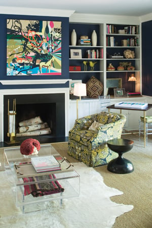
“She might love color even more than I do,” says Benson. “I don’t think we missed a shade in the spectrum.” Most rooms have a hint of Lamarre’s favorite peacock-blue-and-bright-green combo, with pops of orange for vivid contrast. The kitchen features accents of lemon yellow, inspired by a set of china in the same shade that Lamarre inherited from her mother.
The result is an energetic, modern space where bright shades peacefully coexist. And more importantly for Lamarre, “a fun, happy house for me and my girls.”